Thursday 3 June 2010

Evaluation


oh dear oh dear. Im so tired.

---------------------------------------
Major Project Evaluation

After the project, I feel that I’ve been on a rollercoaster ride because there have been many problems but I still managed to complete several of works.

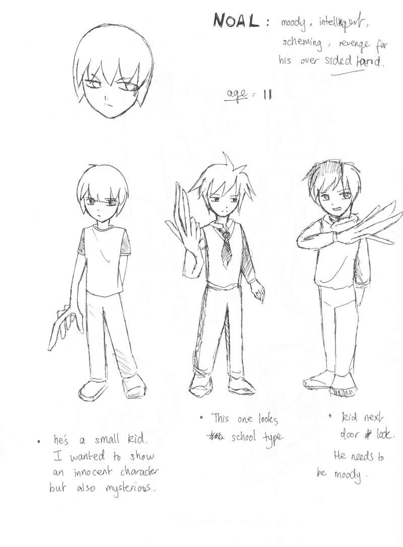
Character designing is like creating life, and I love to enjoy every moment of its development and progression. Sadly in this project I had many time issues and it affected my work and me. I wasn’t able to invent a personality deeply enough for each character and the story didn’t have any environmental backgrounds. With that problem I feel sorry for my characters because I don’t want them to exist as just cartoon illustration or something that was drawn out to look pretty. What helped me to design a meaningful character was I written out a script for each role so I have an aiming concept to present.

What I found the most fun was actually the beginning were I spontaneously doodled in my sketchbook. It had personality, different facial expressions and funny poses in body language. With these sketches you can eventually branch out from it and start picking out the parts you find worth developing. Things I hated were the lining art. I already drew the sketch version but over lining them neatly and in a bigger A3 size took a long time. The outlines had to be drawn larger and it made the process feel off putting because I had to reach from one corner of the graphic tablet to the other side just to make a small detail. Although it wasn’t enjoyable, the ending result was worthwhile.

Through the project, I learned many skills in the process such as drawing on a bigger scale and getting to understand colouring tones. I got the idea about presenting character sheets with different facial expressions and poses.
If I had more time, I would create the backgrounds for the characters so we get a better understanding of what environments then come from or where they might live. I didn’t do enough coloured images and I understand the colour is an important element of a character’s personality. What I want to change is the time management. My organisation in time is poor but to get some time I tried to take as many days off as possible. I was surprised that designing a character would take up so much time. The evolution and development was one thing but presenting them well was another difficult task. This project had its ups and downs but I defiantly grown to like character designing even more.

Some Colour?


omg do we see colour? I guess colour is also important within character design because its another element that expresses different characteristics.

hurrah! To be honest, colouring an image is something I still have to learn. I find the shading techniques and tones are hard to understand.

Kriss Sison


He was the artist who drew the comic Last Hope from http://gomanga.com/manga/lh.php
I got the comic and the best features where the character sketches at the back. My favourite is the mascot character called Hiccup. On these 2 pages it showed me how it began and developed from.


The script for characters

Mio, the Heroine: Comes from a family that does strange bio experiments. Mama already passed away due to accident. Dad neglects her at first because she was different and never liked what her father does. Short temper, hates hassle and moody most of the time. She’s very logical but never attend class. Spends a lot of her days messing with her guitar (left handed). Wondering why she attracts trouble and dodgy people.

Noal, the Villian: Once kicked the ball over to the Mio’s house back garden. He wanted to get it back so he sneaked into the house. Unfortunately he touched one of the chemicals from Mio’s dad and his right hand grew into a beast. Those around him became scared and making him feel alone. Now he’s changed negatively and wants to find the heroine for a cure first by threatening her.

Penman, supporting character: Total dumbass! Easily being used. I.Q so low to the point that he can be persuaded to do almost anything as long as there’s money involved. He can be a narcissist.

Mio’s father: crazy, all day long playing with chemicals and loves the excitement of what possible effects they could create. He doesn’t understand why his daughter is so unlike his crazy-self. He still loves her but just shows it in a strange way.

Final Line art 2

More line art. I realised that I could work better on a coloured background rather than drawing on a blank screen.

Wednesday 2 June 2010

Final Line art 1

YEAH! So tired after hours of lining the designs. I also added different facial expressions and costume ideas.


Progress 2


Various screenshots of the line art Im doing for the final designs. It was very time consuming because I was working on the A3 size. Its my first time drawing on a larger format and I found it difficult to work fast with the lining.

Progress


Some images done on photoshop. I pretty much got the final design of the heroine and I captured that rebellious look. She has a high pigtail because of her father but I somehow made it passable for a 16 year old.

Practice


These are screenshots of various characters that i've designed. This is more of a practice for me to get used to the graphic pen tablet more fluently and freely. I feel that drawing in a sketchbook is more for brainstorming, and you can simultaneously think of many concepts and ideas. When i approached the graphic tablets, I understand that you have to work on a bigger canvas? this way the resolution will be better? I guess the advantage is that layers can prevent many mistakes usually made in physical pen and paper drawing.

Scans2

Here are more ideas for the other characters in my sketchbook.

I had the most fun designing this character. I wanted to make him appear funny at the same time a little crazy and scary. Its because the heroine and the villain is rather depressing, I thought this character needs to have the personality that stands out with a positive behaviour.

The father was rather difficult because Im not good with designing a father figure. I tried mustaches and big fat body structure but I couldn't express that strange abnormal element at first until I thought about masks that hides his facial features.

Scans

Sketchbook scans (^_^). This is where the fun starts. Its all done with a black gel pen, this way it prevents me from drawing neatly and it just gets all the ideas down quickly.


This is Mio the Heroine. It wasn't that difficult to have ideas for her since she's the main character. I tried various types of hair styles and just branch of from that point. I didn't decide her age until I almost nailed the final design but I was aiming for the ages of 16.


Here is designs for Noal the Villain: I reckon that a villain doesn't have to look evil or have any symbolic signs that show they are the bad guys. If thats the case I tried to give Noal a expressionless approach.

Kuroboshi Kouhaku


He is known for the series 'Kino's Journey' (picture). The person in these images is actually a girl. I thought he was a young boy at first due to the short hair, guns and moped. I realised that his artworks are done with dull colours but it gives that sketchy quality. Kuroboshi works as an illustrator and character designer for certain novels and anime.

Endling artworks


I love this guys work. http://endling.deviantart.com/

In a way it looks anime-like and western at the same time. I admire the way he colours his characters and the way he presents their profile with a age story. It totally shows the audience a good idea of the backgrounds.


Rumiko Takahashi


Takahashi was one of my favourite anime artists back then and I read alot of her manga. This is a design sheet/colour version of the main character from her series Inu-yasha. The lines are incredibly neat and interesting choice of colour.

Kozue Amano


This is a scan from one of Kozue Amano's artbooks. The image shown here is a character sheet of some of his characters from the series Aria. This gives me an idea of what layout Im suppose create with my own characters.

Tuesday 1 June 2010

ArkhamDesignStudios


http://www.arkhamdesignstudios.com/

Another website I was looking at for ideas. Interesting choice of using black and white for the background and fonts. Im not liking how the contents of the site are all leaning to the left of the screen and why not display it in the middle.

Website showcase


I made several pages of what my website would look like. There's alot of competition in my field of freelance character designing/illustrator so I've put the aesthetics of the site into consideration. I want it to be colourful, bold and simple to navigate.

My business card


This is the final layout of my card. I decided not to make the edges curved because I have borders therefore it might slant went it gets cut in production.

My final look of the card. I had a better border and a slightly lighter green colour.

Designing business cards

To have a business card is crucial because you have to look professional and its convenient if wanting to quickly set a good impression to your potential clients.


1. I want my card to be simple and just have all the basic information to contact me quickly.

2. My main theme is clovers so I used greens mainly. The second idea is too dark for my liking and the information on the card is light to be seen clearly.

3. Out of these designs I like this green colour the most since it feels most relaxing and fresh to the eye.
4. The layout of the image and information is best on the card but the green colour is still too dark.

Promotion strategy with a website porfolio.


To promote myself, Im going to make a website with a porfolio of work. This way people can quickly access my work and get an understanding of what my illustrations and designs look like.