Thursday 5 August 2010

Shenmue by SEGA


Shenmue is known to be a adventure game with interactive features for the player. The story is written to be more realistic to everyday life so it effects the design of the character. The clothing is modern wear and normal to our world. Perhaps knowing the characters will be developed into a 3D model, the artist kept the details to the minimum. I don't like the outcome of the final 3D model because they didn't maintain that style shown in the sketch above. Maybe 3D modeling wasn't as advance when it was made back then but i find the facial expressions very stiff.

Grandia by Game Arts


This is one of the first role playing games that I have played and enjoyed because of the interesting characters. By looking at these sketches, I like the way they are presented therefore I prefer facial expressions of characters done roughly. The watercolours show before stages and it brings the images alive. I recon using these mediums to design characters are better when thinking of ideas. Its more free and not having to worry about them being neat.

El-Hazard: The 3 priestess

El-Hazard is an anime I watched a while back. The image shows three supporting characters who each have their own elements. Although they're not the main characters, I think they leave a big impact on the viewers.

The reason behind it is that their personality, clothing, and colour designs are based on their own special powers such as fire, water and wind. The artist created them so all the features will reflect the idea of that element.

Monster Hunter designs


This is a game of hunting where you upgrade your status by collecting armor, weapons and clothing. Many designs are needed for the original avatars, monsters and non playing characters. The character avatar used for the game players are mainly warriors but they differentiated by costumes based on world cultures. There are designs such as western medieval, Egyptian, Asian samurais or ninjas, Russian fur outfits and African tribal appearances. Costumes and clothing of the character is important so they focused on the details since the game will also be developed into 3D.

Wednesday 4 August 2010

Sonic the hedgehog

Sonic the hedgehog was created in 1991 and throughout many series of games, the character has been developed and evolved as the time passed. They kept his main features such as the colour blue with the gloves and red shoes.
The first stages of Sonic. He seems simplistic and childlike. The basic idea is that they had to capture his fun, easy going, short tempered and trouble maker personality. Having a speed faster than sound, they gave him features of blue spikes since he's a hedgehog.
This image has the turn around poses. Over all the shape of his head is rounder and the pupils are larger. The style is still childlike.


Most recent appearance. Personally I like this style the most. They developed Sonic to look more intelligent and mature. The features havent changed but the eyes are more green. His body structure has become slim and the spikes are more exaggerated and bigger.

Trinity Universe


In anime Role Playing games, the appearance of the characters are crucial since you have to go through the story by using them. If the characters aren't like-able then it is pointless.

In the recently released game Trinity Universe, the first thing I noticed was the colours. Each character has similar faces because of the artist's style but they are different from costume, and other details. But colour has a strong impact and I see each one of the characters has their own palette.

Spirited away


In Studio Ghibli animations, they tend to focus on the actions of body language and facial expressions. Their works have been known to have flexible and realistic movements. To figure out their character's personality and reactions, many poses and faces need to be experimented to each one of them. The main female character from Spirited Away is a child and they portray this concept really well by making her appear innocent and being naive.

CAPCOM Street fighter


In the Capcom company, there are many artists that have drawn for the Street Fighter series and I looked at various styles. In fighting games, the characters must be appealing because its what attract the game players to go for these games. Street Fighter characters are all quite toned and muscular and Capcom tend to consider the body structures. The anatomy is important and the proportion has to be as realistic and accurate as possible. Each character has their own style of fighting so I see Capcom looking into poses from different countries martial arts. They experiment with kicks, punches, jumping and the special moves. For a fighting game, there is alot more work needed for the characters when compared to those from animations and cartoon films.

Old Master Q


I grew up reading these comic series which was first published inside newspapers and magazines in the 1962. The main meaning was to be humorous and I think because of the character designs they easily conveyed that feeling. Today, the comic is still continuing and its good how the characters have maintained the same features throughout the series. I find it interesting how the personality of the main character old master Q (person with hat) never matches his looks. He is an old man so we assume he would be grumpy, gloomy and slow but there is more to his appearance. He can be perverted, witty and cheeky. His reactions are exaggerated and the movements he does are almost too flexible.

Wall.e sketches


I looked into one of my favourite animations Wall.E. There were many developments of objects and characters by experimenting with the features and details. The art and sketches shown stages and movement. I personally like the expressions and poses of the characters. The poses can show how the character behaves. In Wall.E, the characters are mainly robots and futuristic themed. They looked at how they can express facial features with a living robotic objects. To me, I think they managed to succeed by changing the shape of the eyes depending on what behaviour.

Thursday 3 June 2010

Evaluation


oh dear oh dear. Im so tired.

---------------------------------------
Major Project Evaluation

After the project, I feel that I’ve been on a rollercoaster ride because there have been many problems but I still managed to complete several of works.

Character designing is like creating life, and I love to enjoy every moment of its development and progression. Sadly in this project I had many time issues and it affected my work and me. I wasn’t able to invent a personality deeply enough for each character and the story didn’t have any environmental backgrounds. With that problem I feel sorry for my characters because I don’t want them to exist as just cartoon illustration or something that was drawn out to look pretty. What helped me to design a meaningful character was I written out a script for each role so I have an aiming concept to present.

What I found the most fun was actually the beginning were I spontaneously doodled in my sketchbook. It had personality, different facial expressions and funny poses in body language. With these sketches you can eventually branch out from it and start picking out the parts you find worth developing. Things I hated were the lining art. I already drew the sketch version but over lining them neatly and in a bigger A3 size took a long time. The outlines had to be drawn larger and it made the process feel off putting because I had to reach from one corner of the graphic tablet to the other side just to make a small detail. Although it wasn’t enjoyable, the ending result was worthwhile.

Through the project, I learned many skills in the process such as drawing on a bigger scale and getting to understand colouring tones. I got the idea about presenting character sheets with different facial expressions and poses.
If I had more time, I would create the backgrounds for the characters so we get a better understanding of what environments then come from or where they might live. I didn’t do enough coloured images and I understand the colour is an important element of a character’s personality. What I want to change is the time management. My organisation in time is poor but to get some time I tried to take as many days off as possible. I was surprised that designing a character would take up so much time. The evolution and development was one thing but presenting them well was another difficult task. This project had its ups and downs but I defiantly grown to like character designing even more.

Some Colour?


omg do we see colour? I guess colour is also important within character design because its another element that expresses different characteristics.

hurrah! To be honest, colouring an image is something I still have to learn. I find the shading techniques and tones are hard to understand.

Kriss Sison


He was the artist who drew the comic Last Hope from http://gomanga.com/manga/lh.php
I got the comic and the best features where the character sketches at the back. My favourite is the mascot character called Hiccup. On these 2 pages it showed me how it began and developed from.


The script for characters

Mio, the Heroine: Comes from a family that does strange bio experiments. Mama already passed away due to accident. Dad neglects her at first because she was different and never liked what her father does. Short temper, hates hassle and moody most of the time. She’s very logical but never attend class. Spends a lot of her days messing with her guitar (left handed). Wondering why she attracts trouble and dodgy people.

Noal, the Villian: Once kicked the ball over to the Mio’s house back garden. He wanted to get it back so he sneaked into the house. Unfortunately he touched one of the chemicals from Mio’s dad and his right hand grew into a beast. Those around him became scared and making him feel alone. Now he’s changed negatively and wants to find the heroine for a cure first by threatening her.

Penman, supporting character: Total dumbass! Easily being used. I.Q so low to the point that he can be persuaded to do almost anything as long as there’s money involved. He can be a narcissist.

Mio’s father: crazy, all day long playing with chemicals and loves the excitement of what possible effects they could create. He doesn’t understand why his daughter is so unlike his crazy-self. He still loves her but just shows it in a strange way.

Final Line art 2

More line art. I realised that I could work better on a coloured background rather than drawing on a blank screen.

Wednesday 2 June 2010

Final Line art 1

YEAH! So tired after hours of lining the designs. I also added different facial expressions and costume ideas.


Progress 2


Various screenshots of the line art Im doing for the final designs. It was very time consuming because I was working on the A3 size. Its my first time drawing on a larger format and I found it difficult to work fast with the lining.

Progress


Some images done on photoshop. I pretty much got the final design of the heroine and I captured that rebellious look. She has a high pigtail because of her father but I somehow made it passable for a 16 year old.

Practice


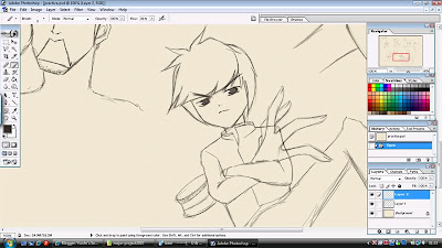
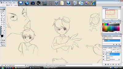
These are screenshots of various characters that i've designed. This is more of a practice for me to get used to the graphic pen tablet more fluently and freely. I feel that drawing in a sketchbook is more for brainstorming, and you can simultaneously think of many concepts and ideas. When i approached the graphic tablets, I understand that you have to work on a bigger canvas? this way the resolution will be better? I guess the advantage is that layers can prevent many mistakes usually made in physical pen and paper drawing.

Scans2

Here are more ideas for the other characters in my sketchbook.

I had the most fun designing this character. I wanted to make him appear funny at the same time a little crazy and scary. Its because the heroine and the villain is rather depressing, I thought this character needs to have the personality that stands out with a positive behaviour.

The father was rather difficult because Im not good with designing a father figure. I tried mustaches and big fat body structure but I couldn't express that strange abnormal element at first until I thought about masks that hides his facial features.
Scans

Sketchbook scans (^_^). This is where the fun starts. Its all done with a black gel pen, this way it prevents me from drawing neatly and it just gets all the ideas down quickly.


This is Mio the Heroine. It wasn't that difficult to have ideas for her since she's the main character. I tried various types of hair styles and just branch of from that point. I didn't decide her age until I almost nailed the final design but I was aiming for the ages of 16.


Here is designs for Noal the Villain: I reckon that a villain doesn't have to look evil or have any symbolic signs that show they are the bad guys. If thats the case I tried to give Noal a expressionless approach.

Kuroboshi Kouhaku


He is known for the series 'Kino's Journey' (picture). The person in these images is actually a girl. I thought he was a young boy at first due to the short hair, guns and moped. I realised that his artworks are done with dull colours but it gives that sketchy quality. Kuroboshi works as an illustrator and character designer for certain novels and anime.

Endling artworks


I love this guys work. http://endling.deviantart.com/

In a way it looks anime-like and western at the same time. I admire the way he colours his characters and the way he presents their profile with a age story. It totally shows the audience a good idea of the backgrounds.


Rumiko Takahashi


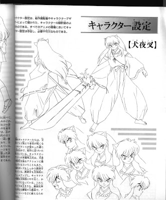
Takahashi was one of my favourite anime artists back then and I read alot of her manga. This is a design sheet/colour version of the main character from her series Inu-yasha. The lines are incredibly neat and interesting choice of colour.