Wednesday, 2 June 2010

Progress


Some images done on photoshop. I pretty much got the final design of the heroine and I captured that rebellious look. She has a high pigtail because of her father but I somehow made it passable for a 16 year old.

Practice


These are screenshots of various characters that i've designed. This is more of a practice for me to get used to the graphic pen tablet more fluently and freely. I feel that drawing in a sketchbook is more for brainstorming, and you can simultaneously think of many concepts and ideas. When i approached the graphic tablets, I understand that you have to work on a bigger canvas? this way the resolution will be better? I guess the advantage is that layers can prevent many mistakes usually made in physical pen and paper drawing.

Scans2

Here are more ideas for the other characters in my sketchbook.

I had the most fun designing this character. I wanted to make him appear funny at the same time a little crazy and scary. Its because the heroine and the villain is rather depressing, I thought this character needs to have the personality that stands out with a positive behaviour.

The father was rather difficult because Im not good with designing a father figure. I tried mustaches and big fat body structure but I couldn't express that strange abnormal element at first until I thought about masks that hides his facial features.

Scans

Sketchbook scans (^_^). This is where the fun starts. Its all done with a black gel pen, this way it prevents me from drawing neatly and it just gets all the ideas down quickly.


This is Mio the Heroine. It wasn't that difficult to have ideas for her since she's the main character. I tried various types of hair styles and just branch of from that point. I didn't decide her age until I almost nailed the final design but I was aiming for the ages of 16.
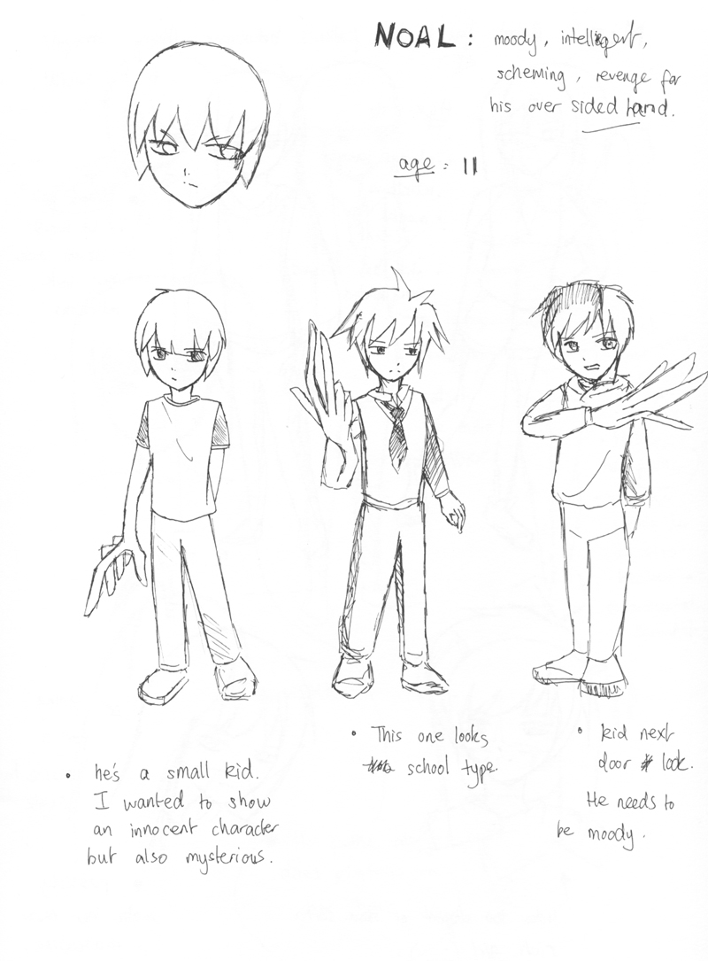

Here is designs for Noal the Villain: I reckon that a villain doesn't have to look evil or have any symbolic signs that show they are the bad guys. If thats the case I tried to give Noal a expressionless approach.

Kuroboshi Kouhaku


He is known for the series 'Kino's Journey' (picture). The person in these images is actually a girl. I thought he was a young boy at first due to the short hair, guns and moped. I realised that his artworks are done with dull colours but it gives that sketchy quality. Kuroboshi works as an illustrator and character designer for certain novels and anime.

Endling artworks


I love this guys work. http://endling.deviantart.com/

In a way it looks anime-like and western at the same time. I admire the way he colours his characters and the way he presents their profile with a age story. It totally shows the audience a good idea of the backgrounds.


Rumiko Takahashi


Takahashi was one of my favourite anime artists back then and I read alot of her manga. This is a design sheet/colour version of the main character from her series Inu-yasha. The lines are incredibly neat and interesting choice of colour.